Magazine advert analysis - Miss Miller
Magazine adverts are an integral aspect of artist and album promotion within the mainstream for many reasons. Firstly magazines are widely read by young people interested in the latest trends and topics, thus the majority of magazine readers would be interested in mainstream genres of music such as pop, hip hop and electronic, meaning artists could promote themselves and appeal to the audience as they enjoy the genre of music. The magazines could also be used as a platform for lesser known artists to gain a wider following, as magazines are read by hundreds and thousands and thus the advertisement and promotion could be extremely useful and could boost sales and awareness of the album. Magazines also are effective in terms of promoting an artist as they could essentially create a new image through design and layout that appeals to a different criteria of audience, which again in turn could result in an increase in sales as the album is not only being promoted to those already interested in the genre but the widened audience that read magazines. Within this blog I will be analyzing two different magazine advertisements deriving from the genre of Psychedelic Rock, and investigating the styles and conventions of these advertisements so that I can use these elements to inspire my own magazine advert for my digipak.

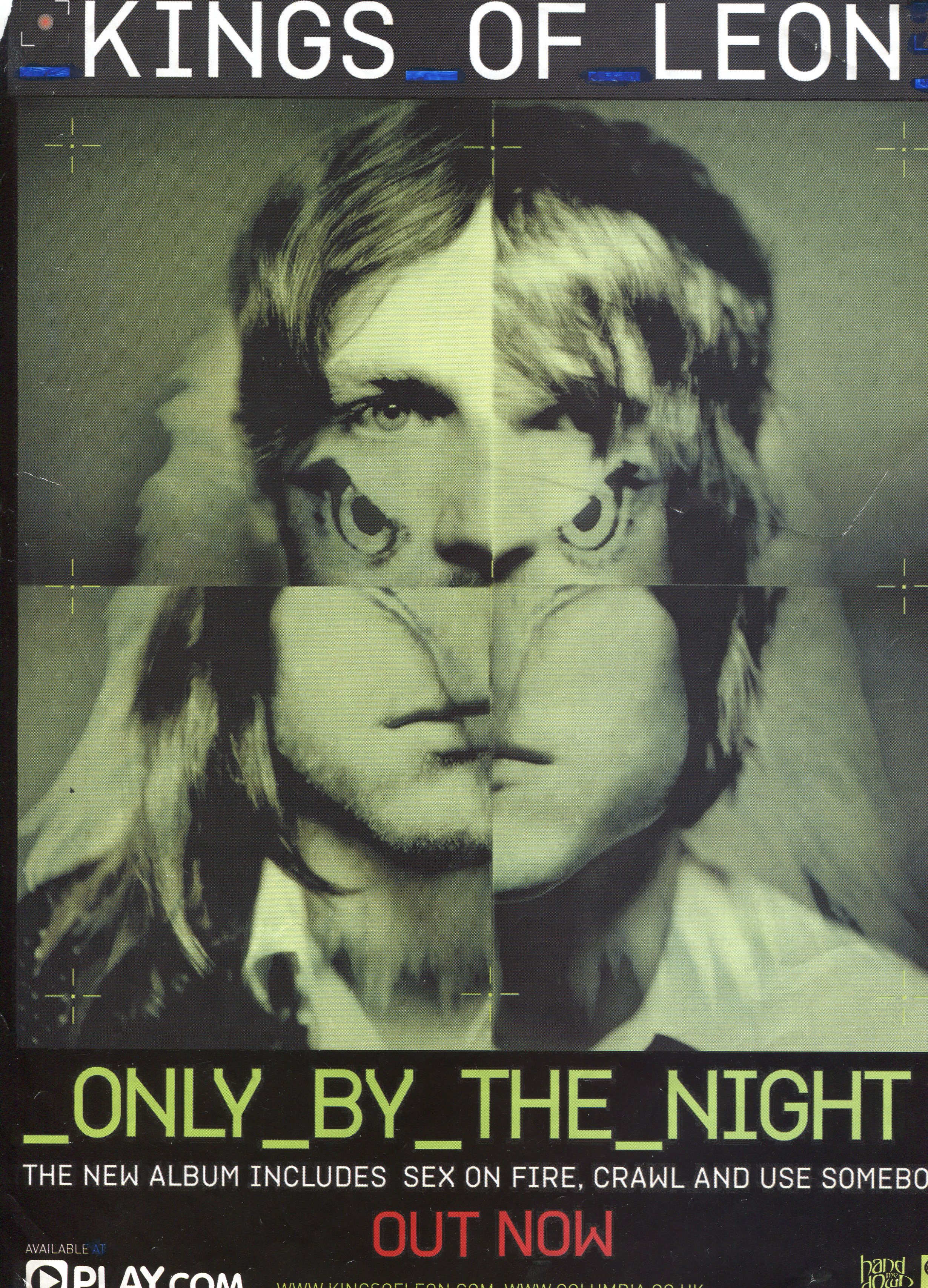
Within this magazine advertisement there are several conventions in terms of design that I have taken inspiration from and I intend to use within my own magazine advertisement as they could be effective in terms of promoting our song and appealing a wide audience. Firstly the colour scheme and design of fonts within the poster is unique and may stand out to an audience, as it is different to what would be normally seen within a magazine, as within the mainstream there is generally an abbundance of bright colours and trendy graphics that appeal to the pop culture and audience the magazine targets. The fonts within this magazine poster are again also very unconventional and may be slightly different to what the audience of the magazine is expecting to see within. The font style is retro and unique, this font stands out from the norm and thus may inspire me to create a font style or implement a stlye that is not normally used within posters.
You have provided a minimal analysis of your music advert, briefly mentioning what some of the various connotations are of the elements used within each.
ReplyDeleteYou need to:
1) Explain fully what each element used creates and WHY
2) Cover ALL bullet points for each advert (typography, design and layout, language etc.)
3) Analyse another advert!
4) Explain how each advert is successful (or not) in terms of promoting the album and artist
5) Include a summary, explaining how and why this research was beneficial, as well as mentioning any inspirations you will take on board and include within your own magazine advert (give examples)
6) You must analyse EVERYTHING used on each poster
7) Finish this