Group Magazine Advert - Miss Miller
Evaluation
Showing posts with label Ancillary texts. Show all posts
Monday, 5 January 2015
Wednesday, 10 December 2014
Individual digipak - Miss Miller
There are many uses for a digipak in terms of the promotional and artistic benefits for a musician and their subsequent record label. The use of a digipak not only results in added features which will appeal to fans of the artists as it includes aspects such as lyrics for the songs and also a personal message from the artist which adds to the personalisation and resultantly the relationship between artist and audience the digipak also results in an increased revenue as it means there is an added source of income in addition to the album and the song itself. Below are the 6 slides that make up my digipak I will discuss the slides in detail and analyse them to discuss the features and how they are conventional to my genre.
Wednesday, 3 December 2014
Individual Magazine - Miss Miller
The use of magazine adverts are incredibly important to artists and their correspond record labels for many different reasons; firstly the use of a magazine advert means the artist's album is publicized more as magazines have thousands of readers and thus a successful advert could appeal and attract a reader which in turn could result in increased sales of the album and a wider following. The use of a magazine advert can also result in creating a new image of an artist, as the use of a variation of lighting, editing, font and colour scheme can portray the artist in a different light, which can result in targeting a variation of readers, not just constricting it to their initial fan-base as readers of magazines vary greatly in terms of age, music preference and general interests which means using a magazine advert that would be deemed conventional and mainstream is effective as it attracts the largest conglomerate of readers which will result in heightened sales. Within my magazine advert there are several features that appeal to the audience, firstly in terms of positioning of the poster, the main character and protagonist of the song "Feels Like We Only Go Backwards" is in the center of the poster, this is as he is the main focus in the music video and is thus should be the main viewing point of the poster. The font of the poster was entitled "Keep On Trucking" and derives from a psychedelic website that has many different psychedelic fonts, the use of this means that despite the abundance of conventional or mainstream features the poster still has psychedelic rock roots, which will appeal to the primary fan-base and may also appeal to other fans of the genre whom are not aware of the song or album. The use of several filters such as Artistic and Texturise, combined with a vibrant colour scheme also appeals to the fans of psychedelic rock genre as the music videos within this genre are famous for their trippy styles which us a variation of special effects and colours. Below is the magazine advert I have created for the promotion of my album and the song "Feels Like We Only Go Backwards." In terms of the positioning of the text the title "White Rhinos" and "Escapsim" is in the middle of the poster below the main image, it is large and catches the eye of the viewer due to the colour not matching the scheme of the background. In terms of the effects used I used Diffuse Glow, and Plastic Wrap, as it gave the buildings a strange glowing look that was unusual and relevant to the drug link within our music genre, I also used blend and burn tools to make the text stand out more.
Thursday, 20 November 2014
Photo Shoot - Miss Miller
Within this blog I will discuss the many different photos we took that reflect the music video and subsequently may feature within magazine adverts that advertise our album and our song "Feels Like We Only Go Backward," and within our digipaks that act as an exclusive bonus to more dedicated fans who make the purchase. I will also discuss the reasoning and background of each picture in detail making reference to its relevance to the song.
This is an image of the main protagonist within our narrative and the performer within the performance aspect of the music video. This character is the key figure within the entire music video and thus this can be seen reflected through the character positioning as he is in the center of the image and the lack of any other characters meaning that he is the only attraction and thus must be the main point of focus from the audience.
This image features the protagonist within the music video however the majority of the shot is taken up by the lights within the fountains, the reason for this being that this is a still from a particular shot within our music video that holds importance. The use of stop motion within our music video occurs here and thus we deem this an important part of music video as the editing is key to our video being succesful and original. The lighting of the image is also aesthetically pleasing to the audience which can add to the appeal of the image.
Within this image contains the protagonist of the narrative within the music video, and also the main performer of the song whom lip syncs the lyrics within the video. The protagonist is the key figure within the image and is positioned in the very center of the image, making him the main focus of the audiences attention as he stands out from the crowd. This image is a still taken from the time lapse within our music video, an integral element of the video that we are certain will be popular as it was a complex process to film and edit and thus we take a still to create a teaser in a sense for the audience.
This image is a still taken from a particular establishing shot in our music video. The intention of this shot within our music video is to set the scene in terms of the narrative as our music video features many different settings and thus in order to eradicate the prospects of ambiguity as the many different locations could be a little confusing to those without explanation. The picture is also very aesthetically pleasing due to the picturesque and nice area it is shot in, the photography is also very good and gets the buildings, sky and fountain in, the audience may find this picture appealing to look at.
Thursday, 13 November 2014
Planning Digipak - Miss Miller
Digipaks are an effective method for artists and record labels to gain extra income and promotion through distributing and selling exclusive special edition versions of an artist's album. Digipaks contain more features than a regular CD album, such as a lyric book and a personal message from the artist to the fans. The Digipak targets the audience more and engages them, creating a stronger bond between the artist and fan, this thus will result in better reviews and thus more sales and better publicity.
Through the research of digipaks that are relevant to my genre of music, I have conducted my own plan and have a vision as to how my digipak will be layed out so it is the most effective and thus can ensure my album is succesful. I will discuss the different aspects within my digipak below:
- Colour - My digipak will feature a variation of bright colours, there are many reasons as to why I chose this colour scheme, firstly in regards to Pyschedelic Rock, many digipaks I found were incredibly bright and varied and thus I will stick to this convention. Bright colours are also attractive to people that like all different genres of music and thus the colours can appeal to not only those who enjoy the Psychedelic Rock genre but a majority of people.
- Font/Text - My font and text will be large and bold, and will also be very conventional to the Psychedelic Rock genre, with a retro style font being used as the entirety of Psychedelic Rock was influenced by the 60's, 70's and 80's by artists such as the Beatles and the Pink Floyd. The boldness within the text will make the name of the band a focal point and the title of the song will grab the attention of the viewer.
- Features - My digipak will include many different features to appeal to the fans and create a relationship between audience and fan. Firstly the digipak will feature a personal message to the fans that thanks them for the support and hopes they enjoy the music, the use of personalized synthesis means the reader believes they are personally being targeted. The digipak will also include lyrics for the song "Feels Like We Only Go Backwards," so that fans can learn the lyrics and can enjoy the song more.
- Connotations - Within the digipak there will several different inuendos making reference to drugs, this is incredibly conventional of the Psychedelic Rock genre and thus must be implemented within my own digipak. The use of a "trippy" effect, a variety of shapes and colours and the band name "white rhinos" will provide double entendre that will intruge the reader and be conventional to the genre.
Thursday, 23 October 2014
Digipak analysis - Miss Miller
A digipak is a patented style of CD that adds to the album, it usually consists of the CD, a promotional poster and other special features that add to the audience's experience . They consist of a gatefold or book style case that folds out and is made of cardboard or paper and they competition with plastic CD cases as they are bigger and provide addition features that can appeal to the audience and create a further link between the relationship of the audience and artist. Digipak's are generally used for CD singles or special editions of albums, and are very popular and common within the music industry. Digipak's are effective and beneficial for an artist for many reasons, firstly the digipak's are a method of both appealing to and addressing the audience.
Wednesday, 22 October 2014
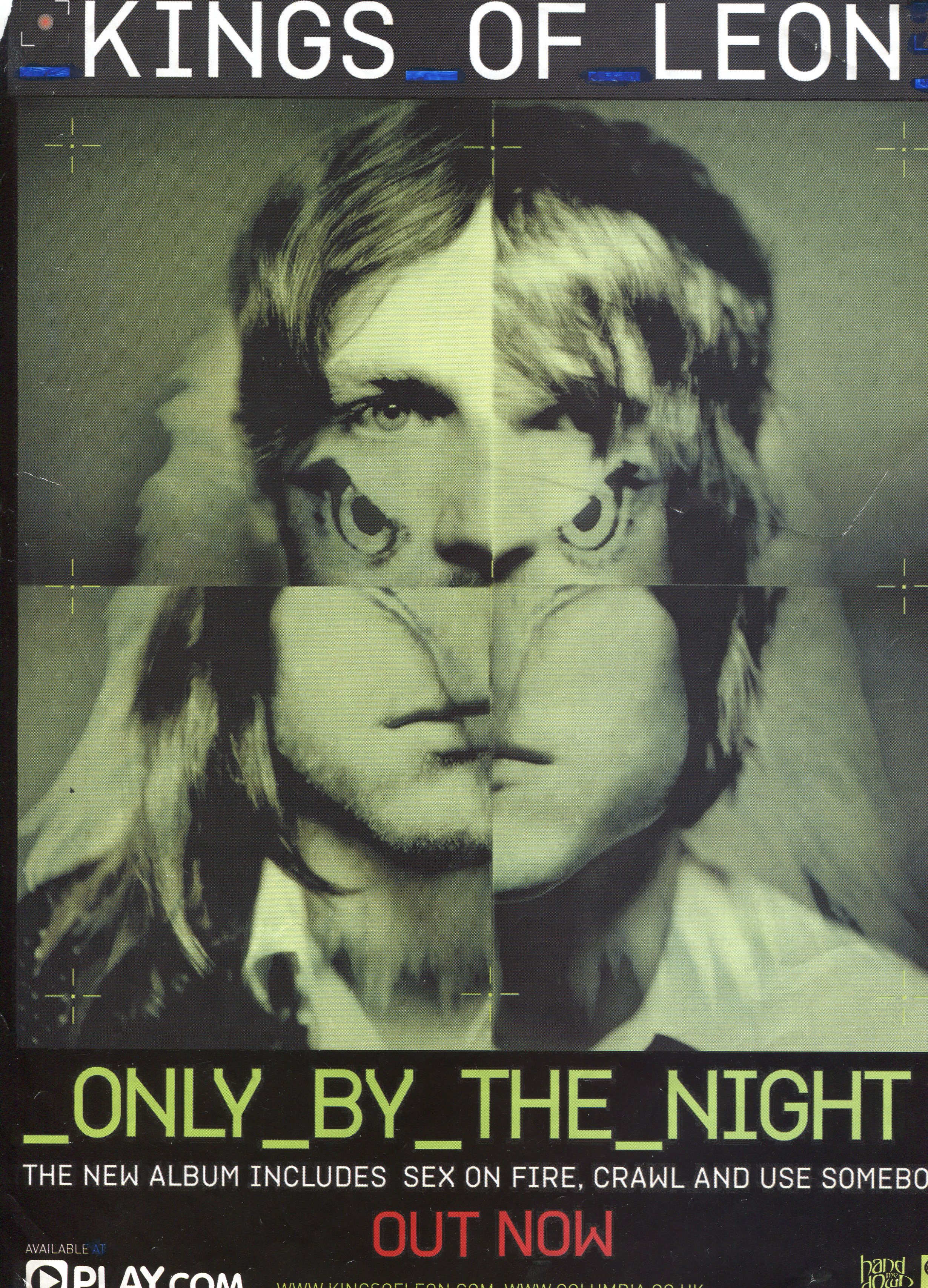
Magazine advert analysis - Miss Miller
Within this magazine advertisement there are several conventions in terms of design that I have taken inspiration from and I intend to use within my own magazine advertisement as they could be effective in terms of promoting our song and appealing a wide audience. Firstly the colour scheme and design of fonts within the poster is unique and may stand out to an audience, as it is different to what would be normally seen within a magazine, as within the mainstream there is generally an abbundance of bright colours and trendy graphics that appeal to the pop culture and audience the magazine targets. The fonts within this magazine poster are again also very unconventional and may be slightly different to what the audience of the magazine is expecting to see within. The font style is retro and unique, this font stands out from the norm and thus may inspire me to create a font style or implement a stlye that is not normally used within posters.
Subscribe to:
Posts (Atom)